
Tortoise & the Hair Logo Design
PROJECT TYPE: Logo & Brand CLIENT: Tortoise & the Hair TIMELINE: January - April 2026Brit Shields engaged Curioko Studio to envision a funky and grounded brand identity and logo design for their new Belmont-based private salon, Tortoise and the Hair. Brit wanted their new branding to stand out in the sea of uninspired hair salon logos and communicate authenticity to the mission of their new business.
Through the logo design, we sought to create a visual identity that was bold and vibrant, while also being a calming invitation to move at a slower pace. We worked in partnership with Brit to identify the overall mood and vibe for the brand identity based on the inspiration boards they had developed for the salon space. From this grounding guidance, we produced a series of initial concepts for the logo and worked through three rounds of revisions until we landed on the final design. The resulting logo evokes a stained glass window with a cascade of colorful hair that opens doors for the tortoise to slow down and pause, creating space for their truest self to shine.
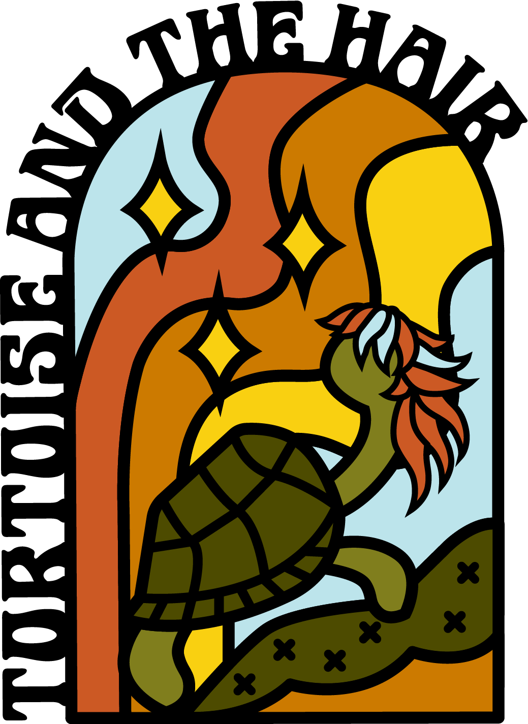
Image Above: Final full color design for the logo mark. 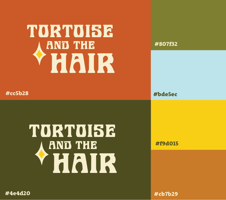
Image Above: Text only logo design with brand color palette.Image Below: Launch graphics for social media and collaborative promotional post.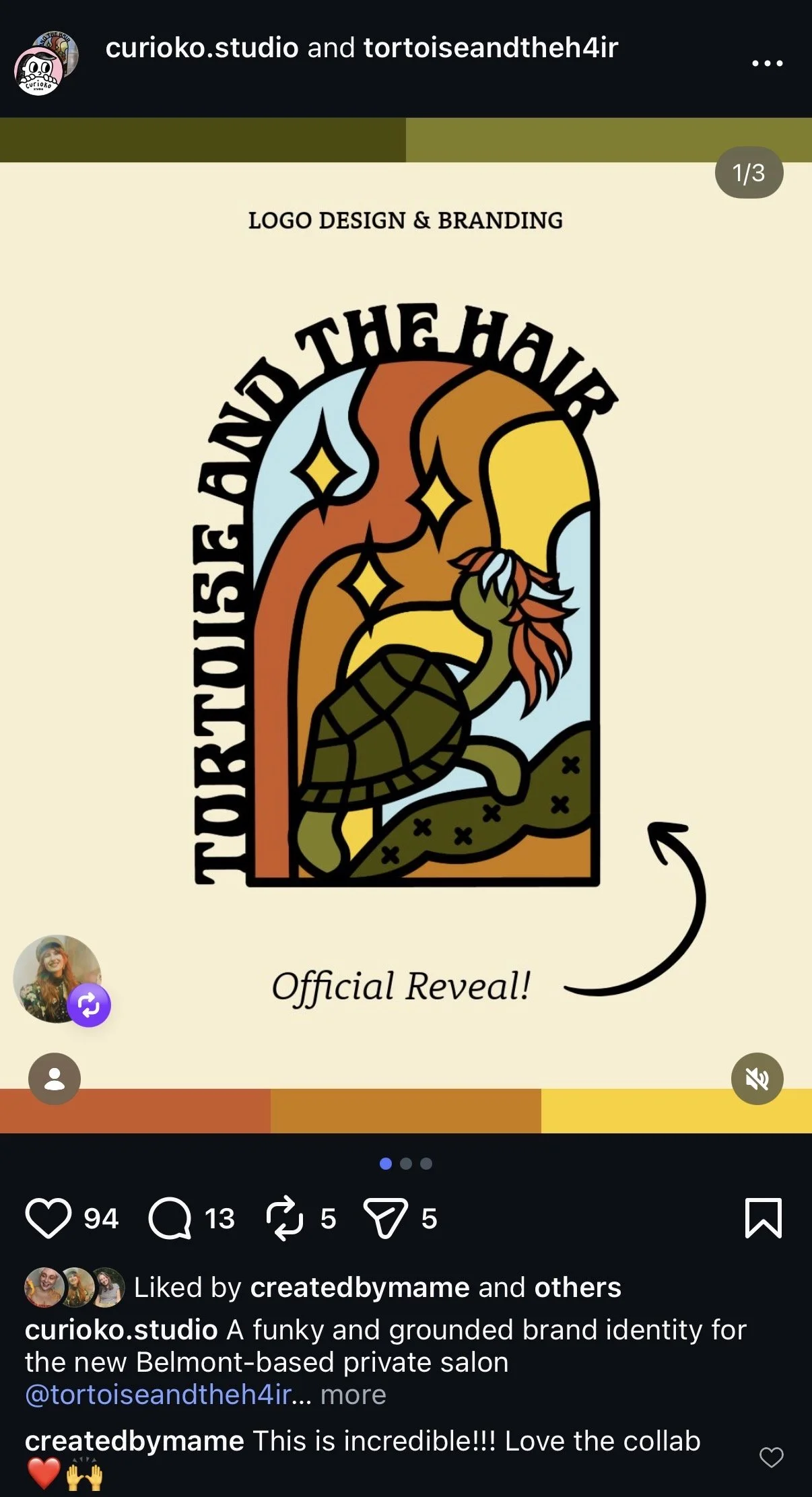
“I was seeking something more unique and vibrant than the typical salon logo. Meg's eye for bright colors and their creative talents captured the essence of Tortoise and the Hair and created a visual identity that pops without being overpowering.”
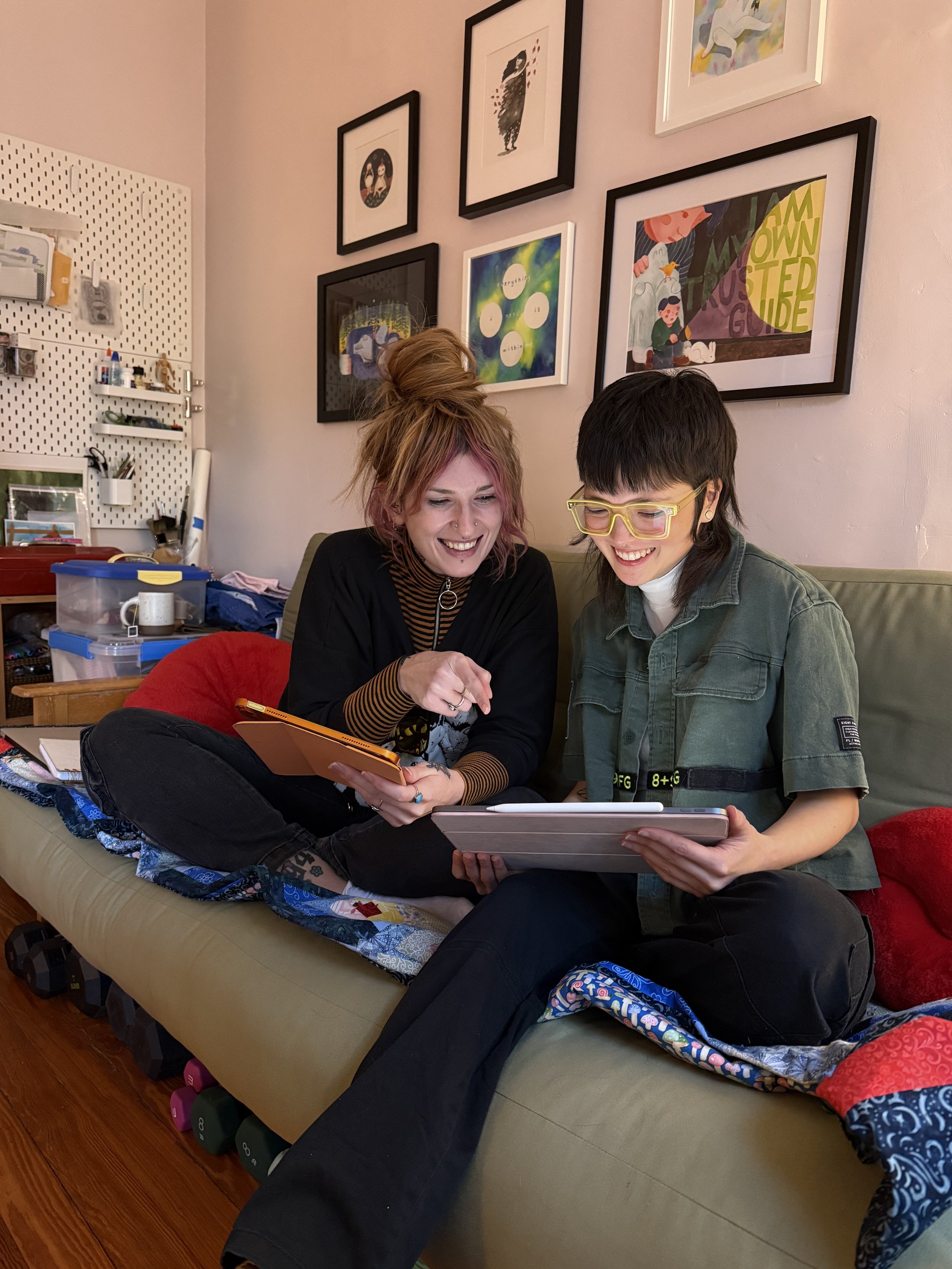
Brit Shields (they/them)
HAIR STYLIST & SALON OWNER, TORTOISE & THE HAIR